LadderBrand Refresh
The project
The visual side of the brand had been relatively untouched since its inception in 2016 and, because of this, the brand strategy no longer served Ladder’s mission or the demographic of customers it was attempting to reach. Our design team was tasked with the opportunity to up-level our brand, visually, to better align Ladder in the insur-tech market.
What we did
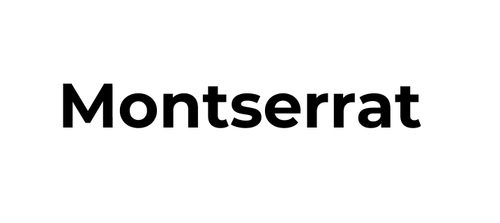
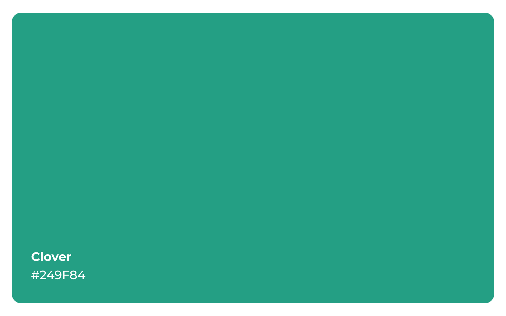
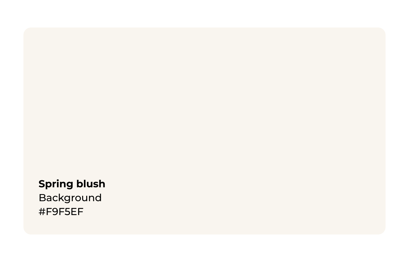
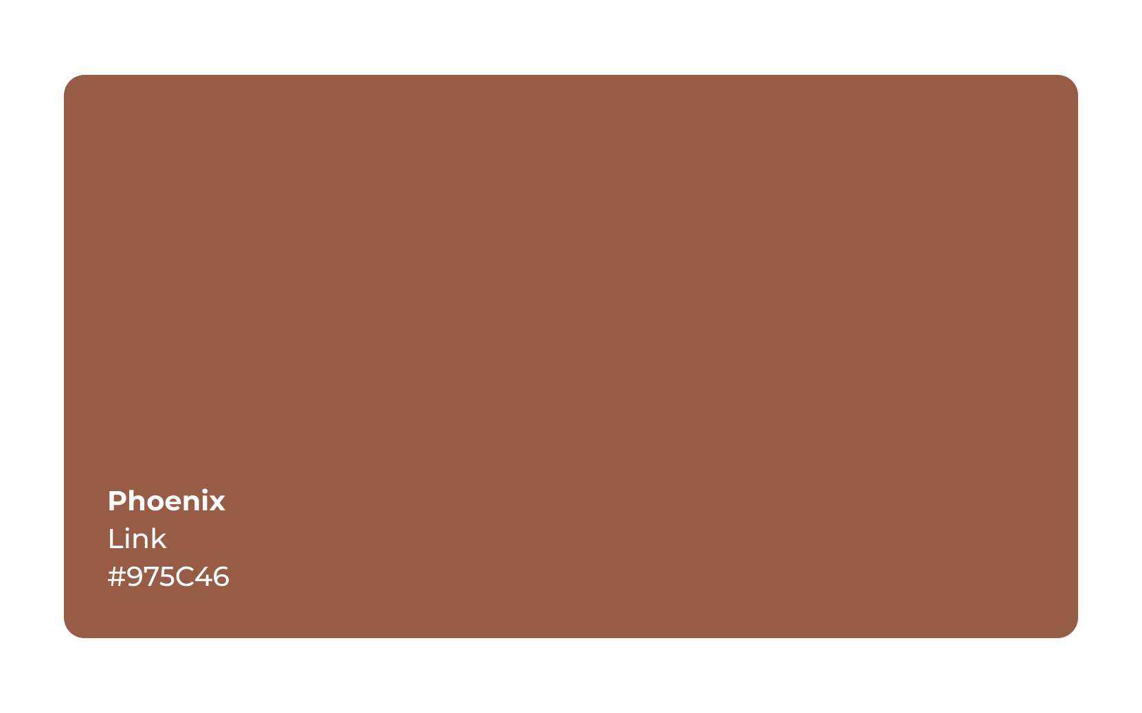
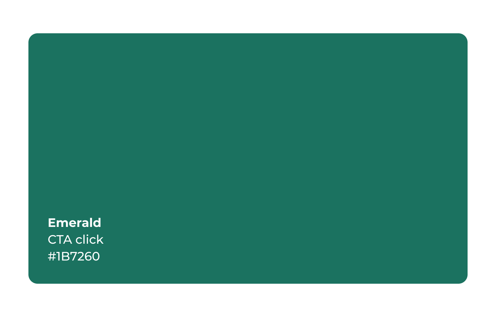
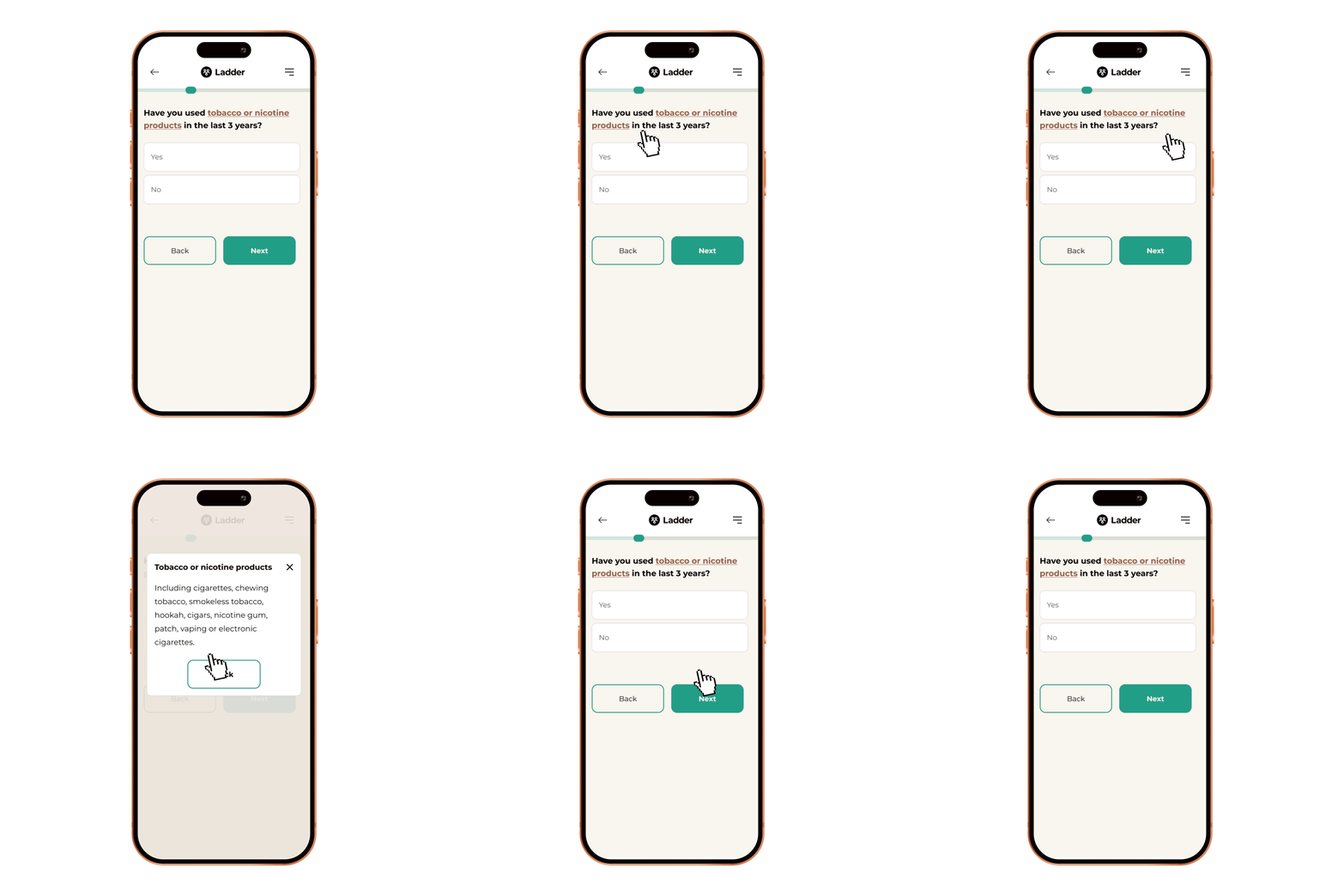
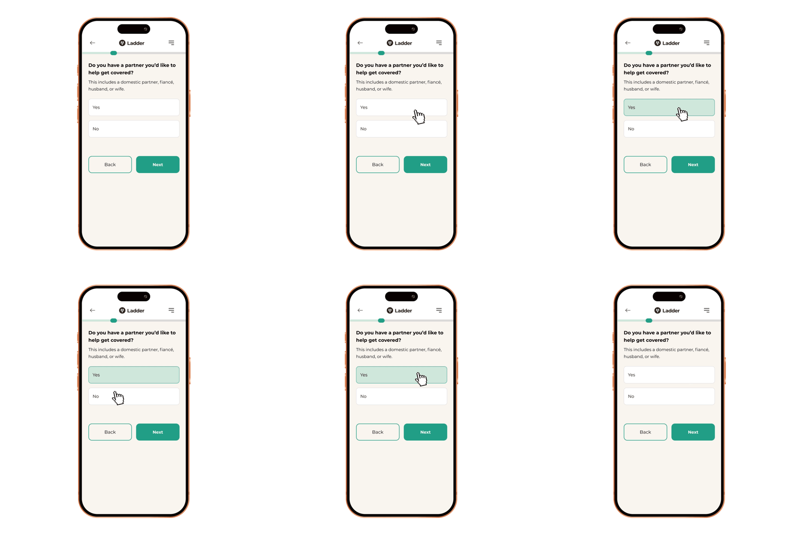
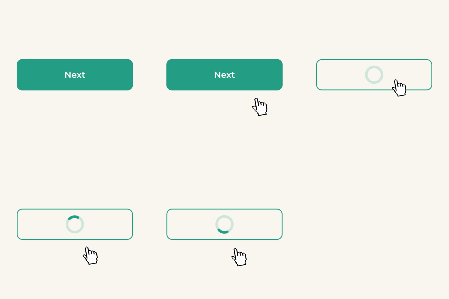
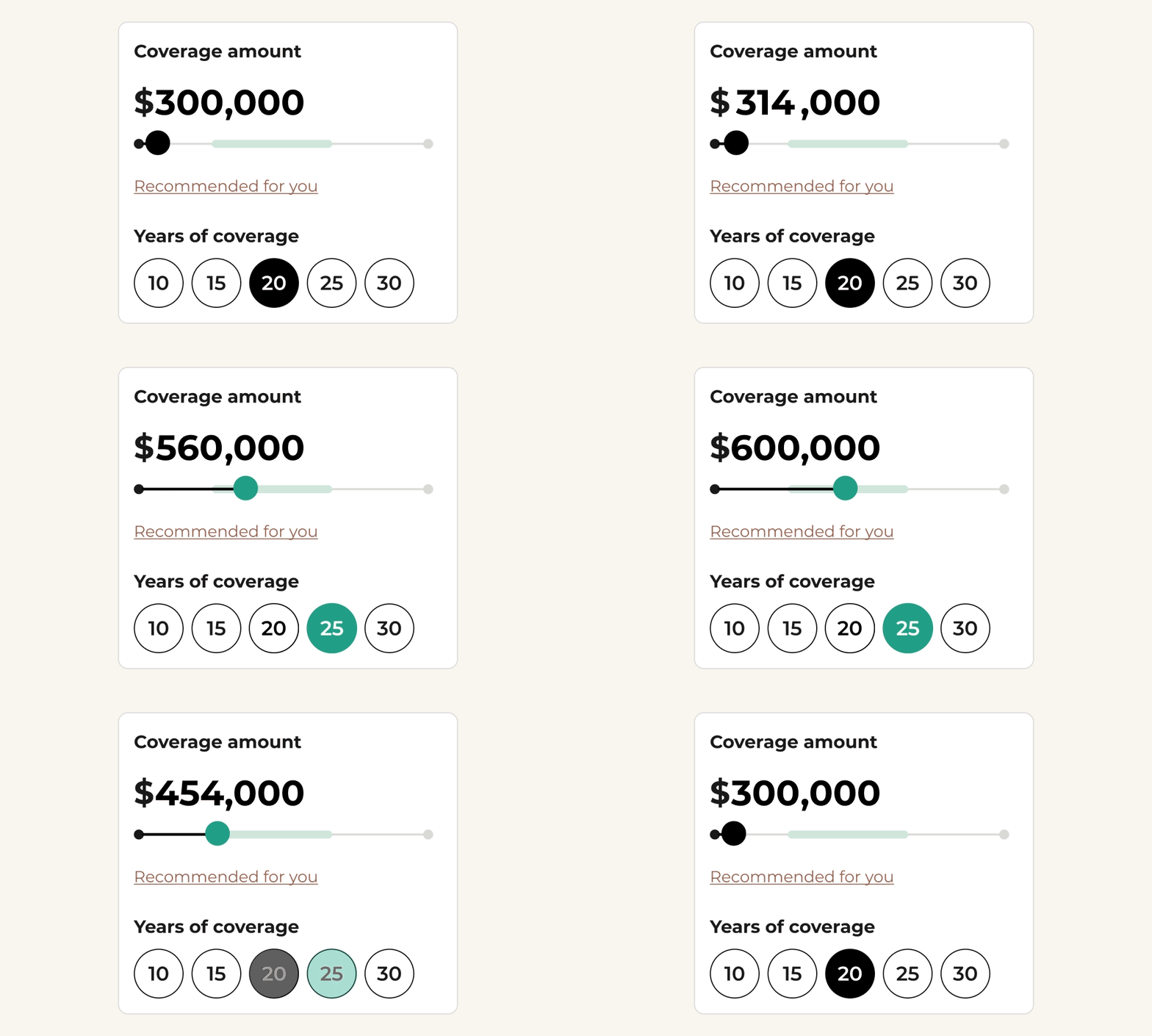
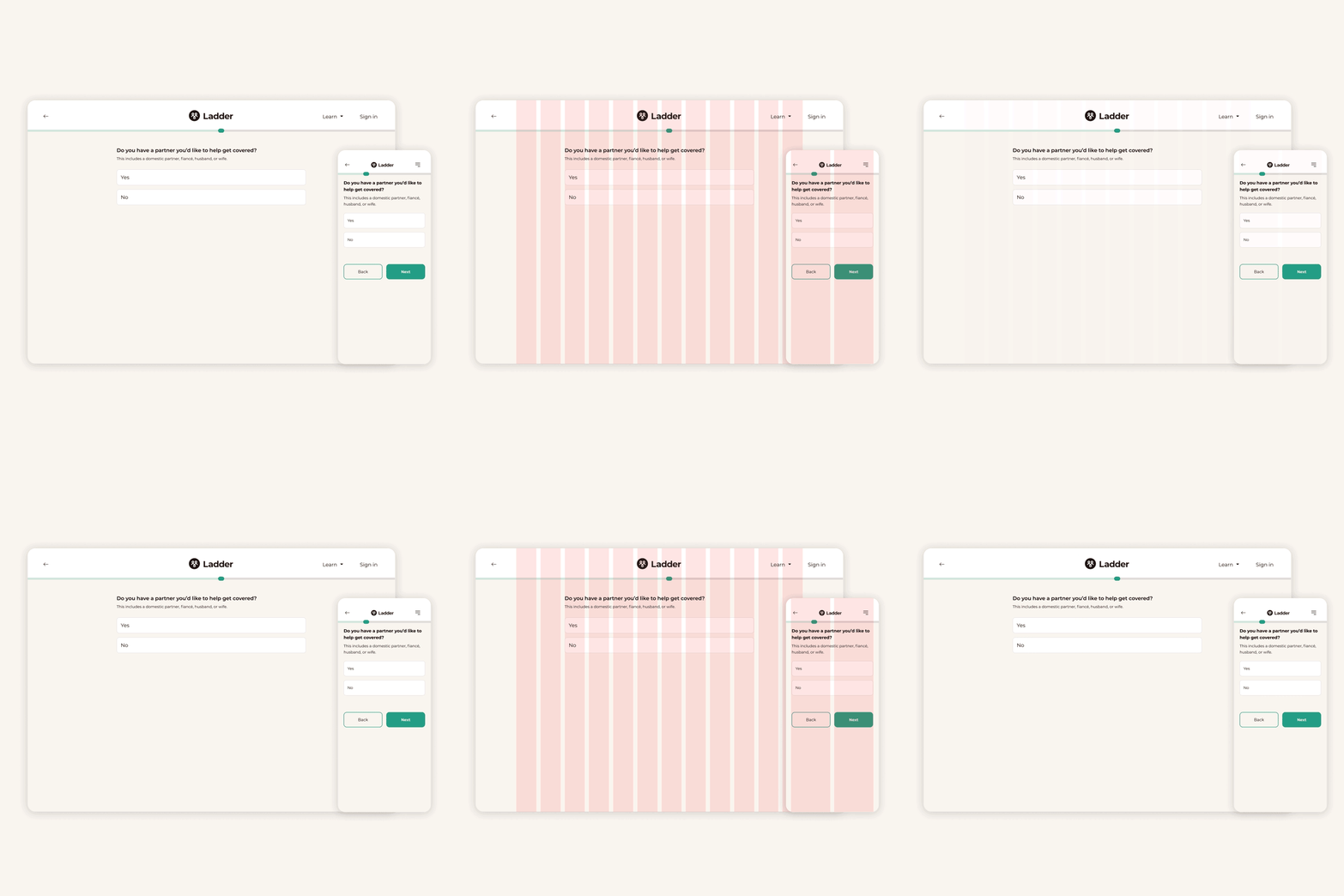
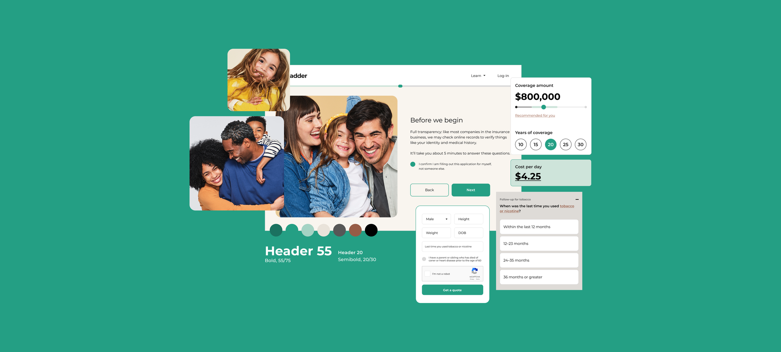
Our visual design team, working cross functionally with our product and content team, first brainstormed and work shopped specific attributes that more accurately represented our brand. From there, we used this brand guide and values exercise to guide and build out a brand that felt parallel. Adjectives like straightforward, savvy, and confident helped to shape the color palette and clarity of our typography hierarchy. While brand adjectives like human-centered and transparent were focused on honoring our existing brand, best showcased in our human forward brand photographs. We focused on optimizing our UI for our mobile customer base, holding almost 60% of our user traffic, by testing spacing and typography matching. The importance of introducing intentional contrast in the application put emphasis on the ease of use and highlighting answers to keep the user’s momentum throughout the lengthy application process. Clover, the brand’s new highlight color, is introduced for moments of direction and encouragement, leaving secondary colors to add life and excitement when required.
Results
Through this clean up, the consistency and clarity of our brand has made way for new partnerships and assisted in enabling our end to end conversion to 2x. Internally, this focus on brand has inspired a movement to lessen the gap of knowledge between design and engineering with the start of a design system. By stepping back and reexamining the parts of the brand that were working and the parts that weren’t, our team has unblocked the path for brand and brand building.